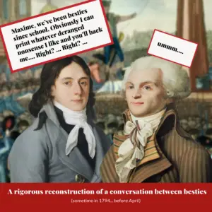
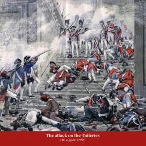

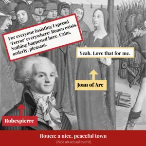


Viral history is not always accurate
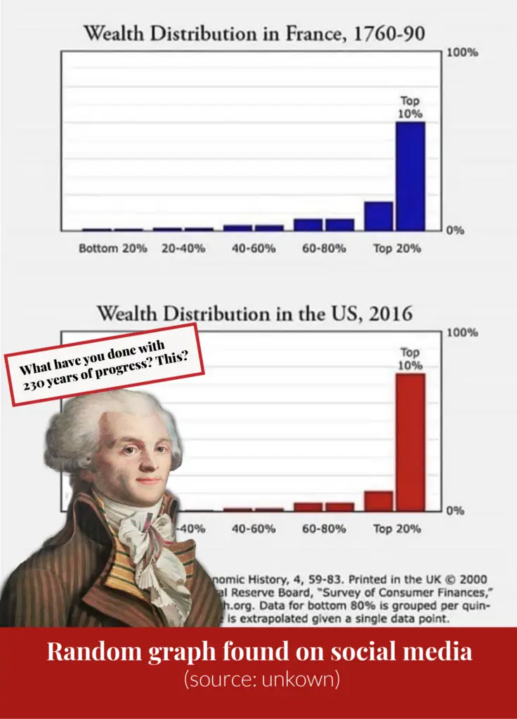
I went back to the original study behind a widely shared graph on inequality in pre-Revolutionary France to see whether the numbers actually support what the graph claims.
Filter
All personalitiesFrench Revolution Actors
No personalities under this letter yet.

I went back to the original study behind a widely shared graph on inequality in pre-Revolutionary France to see whether the numbers actually support what the graph claims.