






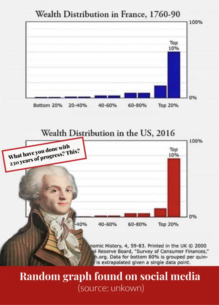
For the past six years or so, this graph has been making its rounds on social media, always reappearing at conveniently timed moments…
The insinuation is loud and clear: parallels abound between 18th-century France and 21st-century USA. Cue the alarm bells: revolution is imminent! The 10% should panic, and ordinary people should stock up on non-perishables and, of course, toilet paper, because it wouldn’t be a proper crisis without that particular frenzy. You know the drill.

Well, unfortunately, I have zero interest in commenting on the political implications or the parallels this graph is trying to make with today’s world. I have precisely zero interest in discussing modern-day politics here. And I also have zero interest in addressing the bottom graph.
This is not going to be one of those “the [insert random group of people] à la lanterne” 1 kind of posts. If you’re here for that, I’m afraid you’ll be disappointed.
What I am interested in is something much less click-worthy but far more useful: how historical data gets used and abused and why the illusion of historical parallels can be so seductive—and so misleading. It’s not glamorous, I’ll admit, but digging into this stuff teaches us a lot more than mindless rage.
So, let’s get into it. Step by step, we’ll examine the top graph, unpick its assumptions, and see whether its alarmist undertones hold any historical weight.
Step 1: Actually Look at the Picture and Use Your Brain
When I saw this graph, my first thought was, “That’s odd.” Not because it’s hard to believe the top 10% in 18th-century France controlled 60% of the wealth. That could very well be true. But because, in 15 years of more or less studying the French Revolution, I’ve never encountered reliable data on wealth distribution from that period.
Why? Because to the best of my knowledge, no one was systematically tracking income or wealth across the population in the 18th century. There were no comprehensive records, no centralised statistics, and certainly no detailed breakdowns of who owned what across different classes. Graphs like this imply data, and data means either someone tracked it or someone made assumptions to reconstruct it. That’s not inherently bad, but it did get my spider senses tingling.
Then there’s the timeframe: 1760–1790. Thirty years is a long time, especially when discussing a period that included wars, failed financial policies, growing debt, and shifting social dynamics. Wealth distribution wouldn’t have stayed static during that time. Nobles who were at the top in 1760 could be destitute by 1790, while merchants starting out in 1760 could be climbing into the upper tiers by the end of the period. Economic mobility wasn’t common, but over three decades, it wasn’t unheard of either.
All of this raises questions about how this graph was created. Where’s the data coming from? How was it measured? And can we really trust it to represent such a complex period?
Step 2: Check the Fine Print
Since the graph seemed questionable, the obvious next step was to ask: Where does this thing come from? Luckily, the source is clearly cited at the bottom: “The Income Inequality of France in Historical Perspective” by Christian Morrisson and Wayne Snyder, published in the European Review of Economic History, Vol. 4, No. 1 (2000).
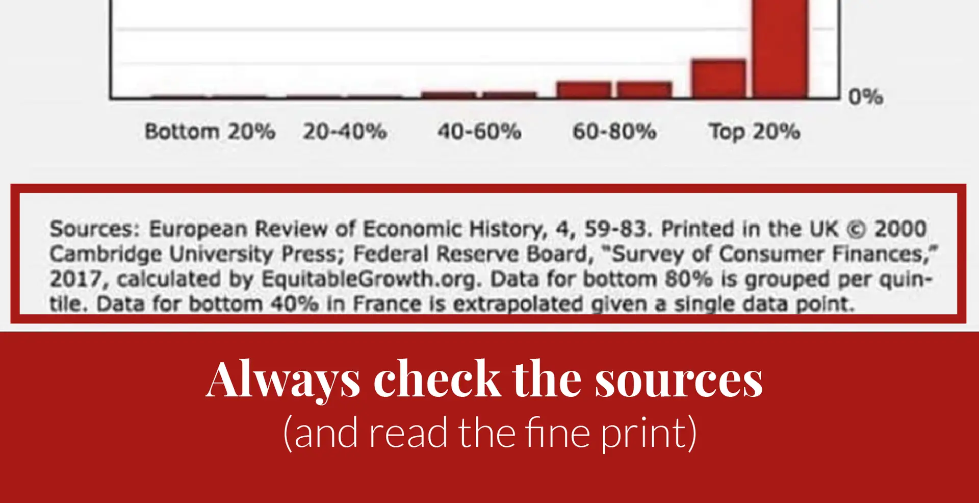
Great! A proper academic source. But, before diving into the article, there’s a crucial detail tucked into the fine print:
“Data for the bottom 40% in France is extrapolated given a single data point.”
What does that mean?
Extrapolation is a statistical method used to estimate unknown values by extending patterns or trends from a small sample of data. In this case, the graph’s creator used one single piece of data, one solitary data point, about the wealth of the bottom 40% of the French population. They then scaled or applied that one value to represent the entire group across the 30-year period (1760–1790).
Put simply, this means someone found one record, maybe a tax ledger, an income statement, or some financial data, pertaining to one specific year, region, or subset of the bottom 40%, and decided it was representative of the entire demographic for three decades.
Let’s be honest: you don’t need a degree in statistics to know that’s problematic. Using a single data point to make sweeping generalisations about a large, diverse population (let alone across an era of wars, famines, and economic shifts) is a massive leap. In fact, it’s about as reliable as guessing how the internet feels about a topic from a single tweet.
This immediately tells me that whatever numbers they claim for the bottom 40% of the population are, at best, speculative. At worst? Utterly meaningless.
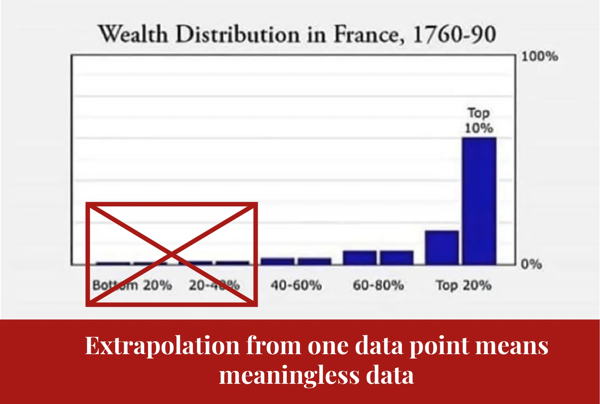
It also raises another question: What kind of serious journal would let something like this slide? So, time to pull up the actual article and see what’s going on.
Step 3: Check the Sources
As I mentioned earlier, the source for this graph is conveniently listed at the bottom of the image. Three clicks later, I had downloaded the actual article: “The Income Inequality of France in Historical Perspective” by Morrisson and Snyder.
The first thing I noticed while skimming through the article? The graph itself is nowhere to be found in the publication.
This is important. It means the person who created the graph didn’t just lift it straight from the article—they derived it from the data in the publication. Now, that’s not necessarily a problem; secondary analysis of published data is common. But here’s the kicker: there’s no explanation in the screenshot of the graph about which dataset or calculations were used to make it. We’re left to guess.
So, to figure this out, I guess I’ll have to dive into the article itself, trying to identify where they might have pulled the numbers from. Translation: I signed myself up to read 20+ pages of economic history. Thrilling stuff.
But hey, someone has to do it. The things I endure to fight disinformation…
Step 4: Actually Assess the Sources Critically
It doesn’t take long, once you start reading the article, to realise that regardless of what the graph is based on, it’s bound to be somewhat unreliable. Right from the first paragraph, the authors of the paper point out the core issue with calculating income for 18th-century French households: THERE IS NO DATA.
The article is refreshingly honest about this. It states multiple times that there were no reliable income distribution estimates in France before World War II. To fill this gap, Morrisson and Snyder used a variety of proxy sources like the Capitation Tax Records 2, historical socio-professional tables, and Isnard’s income distribution estimates 3.
After reading the whole paper, I can say their methodology is intriguing and very reasonable. They’ve pieced together what they could by using available evidence, and their process is quite well thought-out. I won’t rehash their entire argument here, but if you’re curious, I’d genuinely recommend giving it a read.
Most importantly, the authors are painfully aware of the limitations of their approach. They make it very clear that their estimates are a form of educated guesswork, evidence-based, yes, but still guesswork. At no point do they overstate their findings or present their conclusions as definitive
As such, instead of concluding with a single, definitive version of the income distribution, they offer multiple possible scenarios.
It’s not as flashy as a bold, tidy graph, is it? But it’s far more honest, and far more reflective of the complexities involved in reconstructing historical economic data.
Step 5: Run the numbers
Now that we’ve established the authors of the paper don’t actually propose a definitive income distribution, the question remains: where did the creators of the graph get their data? More specifically, which of the proposed distributions did they use?
Unfortunately, I haven’t been able to locate the original article or post containing the graph. Admittedly, I haven’t tried very hard, but the first few pages of Google results just link back to Twitter, Reddit, Facebook, and Tumblr posts. In short, all I have to go on is this screenshot.
I’ll give the graph creators the benefit of the doubt and assume that, in the full article, they explain where they sourced their data. I really hope they do, because they absolutely should.
That being said, based on the information in Morrisson and Snyder’s paper, I’d make an educated guess that the data came from Table 6 or Table 10, as these are the sections where the authors attempt to provide income distribution estimates.
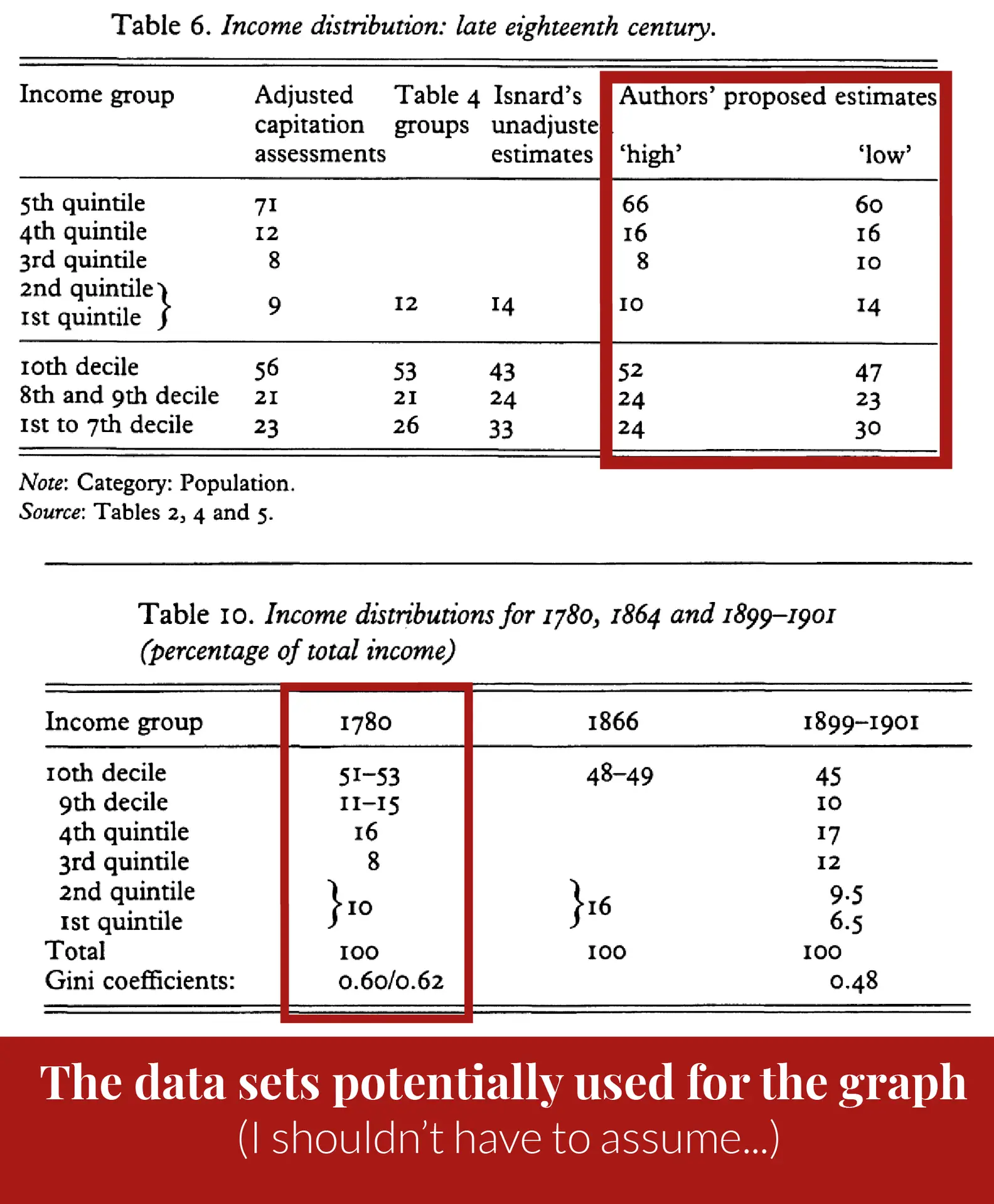
Now, which dataset does the graph use? Spoiler: None of them.
How can we tell? Since I don’t have access to the raw data or the article where this graph might have been originally posted, I resorted to a rather unscientific method: I used a graphical design program to divide each bar of the chart into 2.5% increments and measure the approximate percentage for each income group.
Here’s what I found:
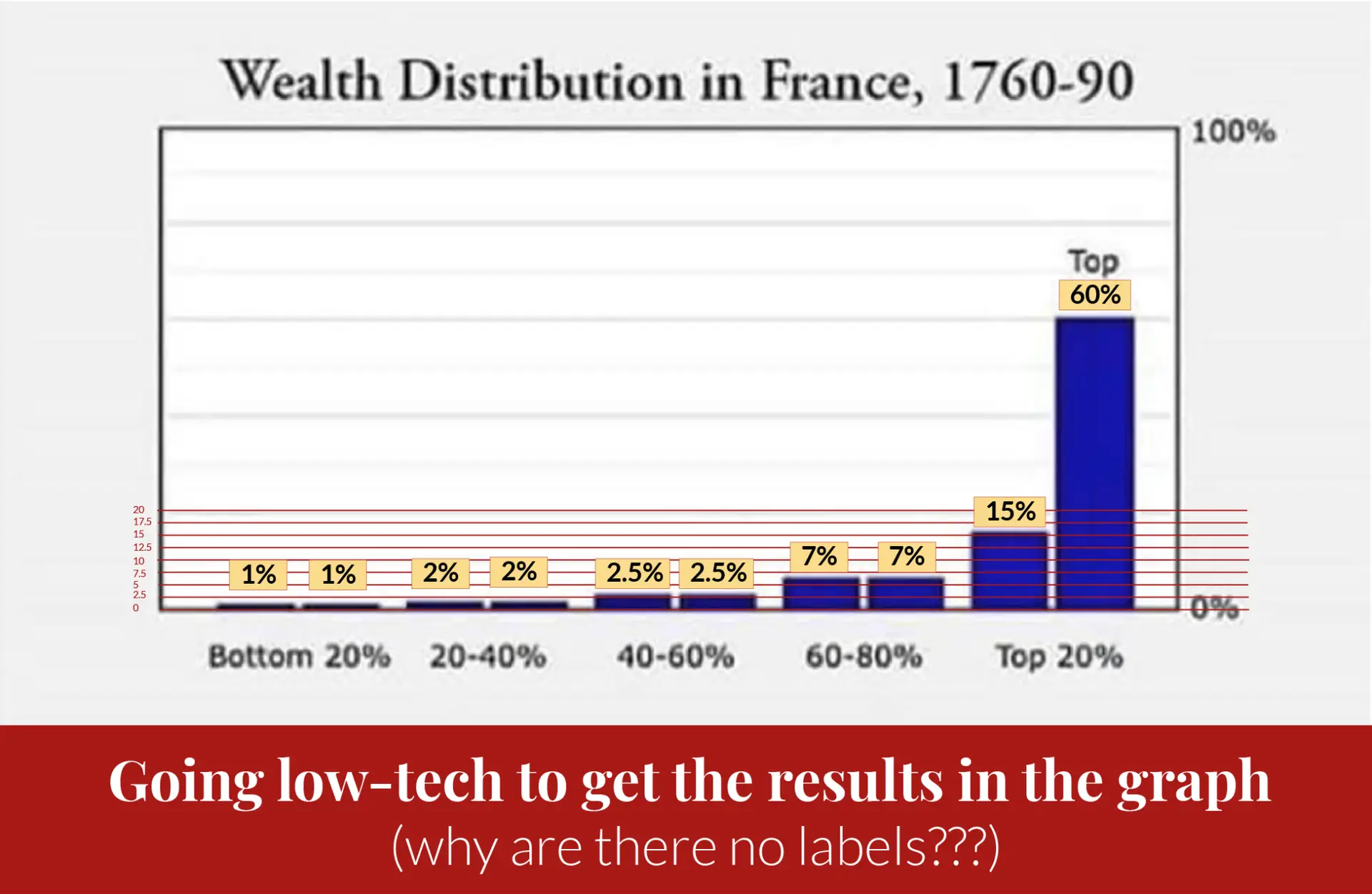
Now, take a moment to spot the issue. Do you see it?
The problem is glaring: NONE of the datasets from the paper fit the graph. Granted, my measurements are just estimates, so there might be some rounding errors. But the discrepancies are impossible to ignore, particularly for the bottom 40% and the top 10%.
- In Morrisson and Snyder’s paper, the lowest estimate for the bottom 40% (1st and 2nd quintiles) is 10%. Even if we use the most conservative proxy, the Capitation Tax estimate, it’s 9%. But the graph claims the bottom 40% held only 6%.
- For the top 10% (10th decile), the highest estimate in the paper is 53%. Yet the graph inflates this to 60%.
Step 6: For fun, I made my own bar charts
Because I enjoy this sort of thing (yes, this is what I consider fun, I’m a very fun person), I decided to use the data from the paper to create my own bar charts. Here’s what came out:
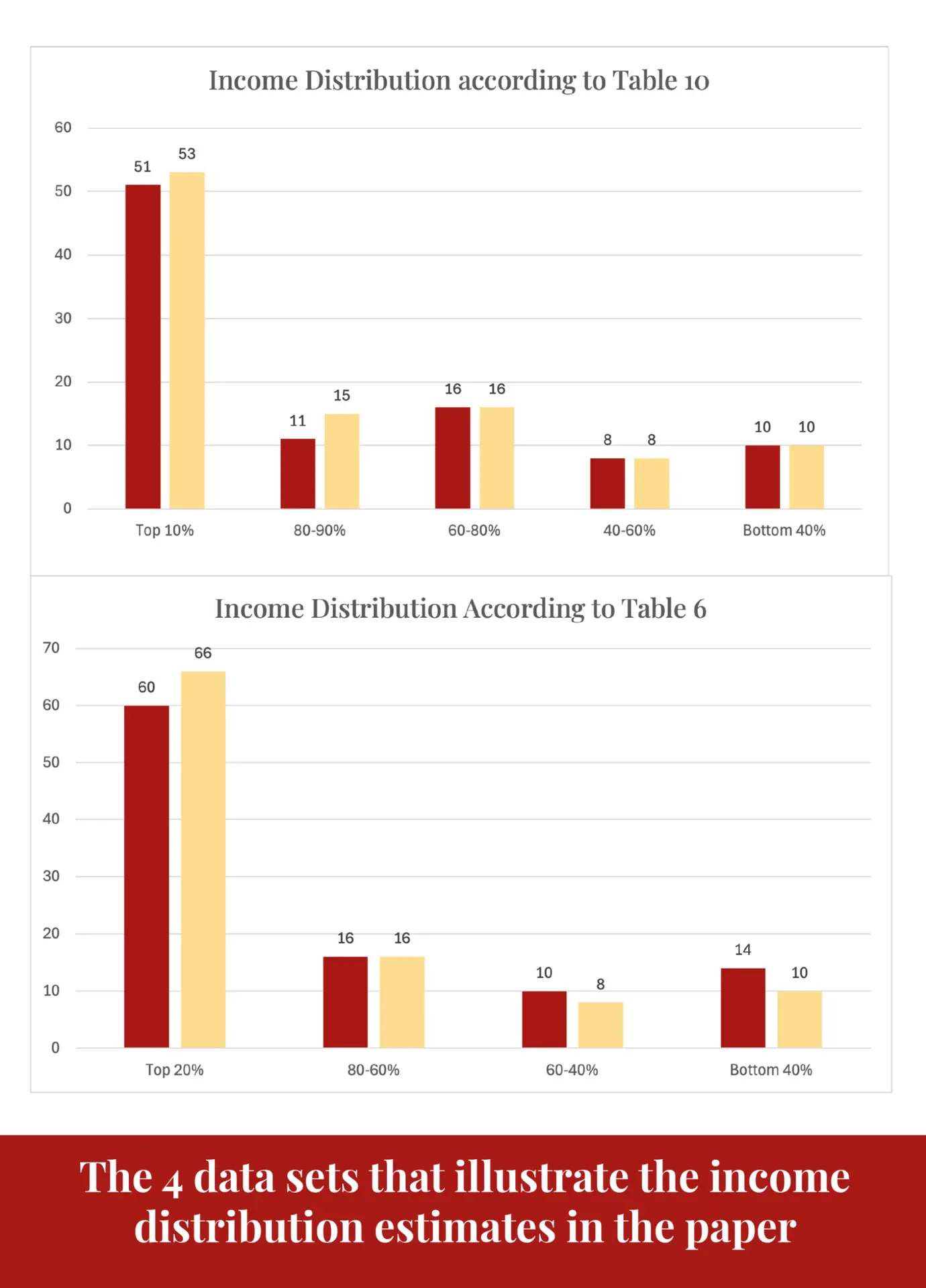
What do you notice?
While the results don’t exactly scream “healthy economy,” they look much less dramatic than the graph we started with. The creators of the graph have clearly exaggerated the disparities, making inequality seem worse.
Step 7: Understand the context before drawing conclusions
Numbers, by themselves, mean nothing. Absolutely nothing.
I could tell you right now that 47% of people admit to arguing with inanimate objects when they don’t work, with printers being the most common offender, and you’d probably believe it. Why? Because it sounds plausible, printers are frustrating, I’ve used a percentage, and I’ve phrased it in a way that sounds “academic.”
You likely wouldn’t even pause to consider that I’m claiming 3.8 billion people argue with inanimate objects. And let’s be real: 3.8 billion is such an incomprehensibly large number that our brains tend to gloss over it.
If, instead, I said, “Half of your friends probably argue with their printers,” you might stop and think, “Wait, that seems a bit unlikely.” (For the record, I completely made that up, I have no clue how many people yell at their stoves or complain to their toasters.)
The point? Numbers mean nothing unless we put them into context.
The original paper does this well by contextualising its estimates, primarily through the calculation of the Gini coefficient 4.
The authors estimate France’s Gini coefficient in the late 18th century to be 0.59, indicating significant income inequality. However, they compare this figure to other regions and periods to provide a clearer picture:
- Amsterdam (1742): Much higher inequality, with a Gini of 0.69.
- Britain (1759): Lower inequality, with a Gini of 0.52, which rose to 0.59 by 1801.
- Prussia (mid-19th century): Far less inequality, with a Gini of 0.34–0.36.
This comparison shows that income inequality wasn’t unique to France. Other regions experienced similar or even higher levels of inequality without spontaneously erupting into revolution.
Accounting for Variations
The authors also recalculated the Gini coefficient to account for potential variations. They assumed that the income of the top quintile (the wealthiest 20%) could vary by ±10%. Here’s what they found:
- If the top quintile earned 10% more, the Gini coefficient rose to 0.66, placing France significantly above other European countries of the time.
- If the top quintile earned 10% less, the Gini dropped to 0.55, bringing France closer to Britain’s level.
Ultimately, the authors admit there’s uncertainty about the exact level of inequality in France. Their best guess is that it was comparable to other countries or somewhat worse.
Step 8: Drawing Some Conclusions
Saying that most people in the 18th century were poor and miserable, perhaps the French more so than others, isn’t exactly a compelling statement if your goal is to gather clicks or make a dramatic political point.
It’s incredibly tempting to look at the past and find exactly what we want to see in it. History often acts as a mirror, reflecting our own expectations unless we challenge ourselves to think critically. Whether you call it wishful thinking or confirmation bias, it’s easy to project the future onto the past.
Looking at the initial graph, I understand why someone might fall into this trap. Simple, tidy narratives are appealing to everyone. But if you’ve studied history, you’ll know that such narratives are a myth. Human nature may not have changed in thousands of years, but the contexts we inhabit are so vastly different that direct parallels are meaningless.
So, is revolution imminent? Well, that’s up to you—not some random graph on the internet.
Footnotes
- 1A la lanterne was a revolutionary cry during the French Revolution, symbolising mob justice where individuals were sometimes hanged from lampposts as a form of public execution
- 2The capitation tax was a fixed head tax implemented in France during the Ancien Régime. It was levied on individuals, with the amount owed determined by their social and professional status. Unlike a proportional income tax, it was based on pre-assigned categories rather than actual earnings, meaning nobles, clergy, and commoners paid different rates regardless of their actual wealth or income.
- 3Jean-Baptiste Isnard was an 18th-century economist. These estimates attempted to describe the theoretical distribution of income among different social classes in pre-revolutionary France. Isnard’s work aimed to categorise income across groups like nobles, clergy, and commoners, providing a broad picture of economic disparity during the period.
- 4The Gini coefficient (or Gini index) is a widely used statistical measure of inequality within a population, specifically in terms of income or wealth distribution. It ranges from 0 to 1, where 0 indicates perfect equality (everyone has the same income or wealth), and 1 represents maximum inequality (one person or household holds all the wealth).
Sources & further reading
- The Income Inequality of France in Historical Perspective” by Christian Morrisson and Wayne Snyder, published in the European Review of Economic History, Vol. 4, No. 1 (2000).